Most resumes fail before a recruiter even reads them.
Not because candidates are unqualified.
Not because they lack skills.
But because their resumes are difficult to scan, overloaded with unnecessary design, or impossible for ATS systems to understand properly.
And honestly? Most people still don’t realize this.
In 2026, resumes are no longer just documents. They’re part of your professional identity. Recruiters open resumes on laptops, phones, applicant systems, and internal dashboards. If your resume creates friction anywhere in that process, your chances immediately drop.
That’s why ATS-friendly resumes matter.
But here’s the thing most websites won’t tell you:
Creating a strong ATS-friendly resume is actually simple.
You do not need:
- dramatic templates
- colorful charts
- complicated layouts
- five-column resume designs
In fact, most of those things hurt your resume more than they help.
The best resumes today are clean, structured, readable, and easy to understand within seconds.
That’s what recruiters want.
And that’s what ATS systems understand best.
First, What Even Is ATS?
ATS stands for Applicant Tracking System.
Companies use ATS software to organize and filter job applications. Before your resume reaches a human recruiter, it’s usually scanned by software first.
That software tries to understand:
- who you are
- what skills you have
- your experience
- your education
- whether your profile matches the role
The problem is that many resumes are designed more for visual appearance than readability.
People download overdesigned templates from random websites and end up creating resumes filled with:
- icons
- charts
- graphics
- weird spacing
- fancy layouts
It may look impressive visually, but ATS systems often struggle to read them correctly.
That’s where things go wrong.
Most People Overdesign Their Resume
This is probably the biggest mistake in modern resumes.
People think a resume should “look creative” to stand out.
But recruiters are not hiring your Canva skills.
They are trying to quickly answer:
- What does this person do?
- Are they relevant?
- Do they have experience?
- Can I trust this profile?
A resume should reduce mental effort, not increase it.
That’s why the best resumes feel calm and structured.
A recruiter should not have to “figure out” your resume.
They should instantly understand it.
Your Resume Has One Job
Your resume is not supposed to tell your entire life story.
It has one job:
get the next conversation.
That’s it.
Many people write resumes like autobiographies. Huge paragraphs. Every school achievement. Every minor task. Every tool they’ve ever touched.
Recruiters do not read resumes word by word.
They scan.
Usually very fast.
Which means:
- structure matters
- spacing matters
- clarity matters
far more than people think.
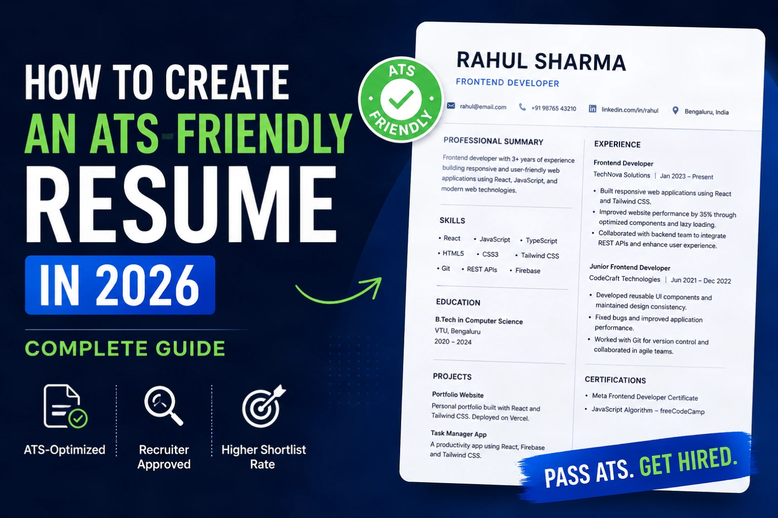
The Best Resume Format Is Still the Simplest One
There’s a reason most successful resumes still follow a very predictable structure.
Because it works.
A recruiter expects to see:
- your name
- what you do
- your experience
- your skills
- your education
- your projects
If your resume tries too hard to reinvent this structure, it becomes harder to process.
Modern resumes should feel modern through:
- typography
- spacing
- cleanliness
not through visual chaos.
Most Resume Summaries Are Terrible
Almost everyone writes summaries like this:
“Hardworking and passionate individual seeking opportunities to grow.”
This says nothing.
Recruiters read hundreds of resumes every week. Generic summaries become invisible immediately.
A better summary sounds specific.
For example:
“Frontend developer with 3 years of experience building responsive React applications for SaaS products.”
Now the recruiter instantly understands:
- your role
- your experience level
- your specialization
That’s clarity.
And clarity is powerful.
Numbers Instantly Make Your Resume Stronger
One of the easiest ways to improve a resume is to stop describing responsibilities and start describing outcomes.
Weak:
“Worked on backend development.”
Better:
“Built Laravel APIs serving 50k+ monthly requests.”
Weak:
“Managed social media.”
Better:
“Grew Instagram engagement by 38% within 4 months.”
Specificity creates credibility.
And recruiters notice numbers immediately because numbers break visual monotony while scanning.
Skills Sections Need Less Noise
Another common mistake is turning the skills section into a keyword dump.
Some people add:
- 40 technologies
- every programming language
- every tool
- every soft skill imaginable
This usually weakens the profile.
A focused skills section feels stronger.
Especially in 2026, recruiters care less about “knowing many things” and more about:
- relevance
- depth
- real usage
It’s better to show strong proof for 5 skills than weak claims for 30.
Most Resumes Fail on Mobile
This is becoming a huge issue now.
Recruiters increasingly open resumes:
- on phones
- during meetings
- inside dashboards
- through quick links
If your resume:
- has tiny text
- weird spacing
- crowded layouts
- unreadable sections
it immediately creates friction.
A modern resume should feel readable even on a smaller screen.
This is one reason online resume profiles are growing quickly. They adapt better across devices and feel easier to share.
Why Online Resume Links Are Becoming Popular
Sending PDFs back and forth is starting to feel outdated.
People constantly:
- rename files
- resend updated versions
- lose track of edits
A live online resume solves that problem.
Instead of sending:
resume-final-v8.pdf
people can simply share:
hereismycv.com/username
The experience feels cleaner, faster, and more modern.
And because the profile stays updated, recruiters always see the latest version.
That’s a major shift happening quietly in hiring culture right now.
ATS Optimization Is Really About Readability
People treat ATS like some mysterious algorithm.
But most ATS optimization comes down to simple things:
- readable structure
- proper keywords
- clear hierarchy
- understandable content
The simpler your resume is, the easier it becomes for:
- software
- recruiters
- hiring managers
to process it.
Complexity usually hurts.
Keywords Matter — But Context Matters More
If you’re applying for React jobs, your resume should obviously mention React.
But randomly stuffing keywords everywhere does not help anymore.
Modern ATS systems are much smarter than before.
Instead of repeating:
“React React React”
show real usage:
“Built scalable React dashboards integrated with REST APIs.”
That feels natural while still helping with keyword relevance.
The Best Resumes Feel Effortless
This is the biggest thing people misunderstand.
A strong resume does not scream:
“LOOK HOW CREATIVE I AM.”
It quietly communicates:
- professionalism
- clarity
- confidence
The best resumes feel easy to read.
And easy-to-read resumes usually perform better.
Final Thoughts
If your resume feels:
- clean
- modern
- structured
- readable
you are already ahead of most applicants.
You do not need visual gimmicks to stand out.
You need clarity.
Because at the end of the day, recruiters are not looking for the most decorative resume.
They are looking for someone they can understand quickly and trust confidently.
That’s what an ATS-friendly resume really is.
